Some of the things I love about jQuery Mobile are:
- It can load everything as a single page. The app screens are represented by divs in the HTML which makes them "virtual pages". So instead of loading lots of tiny little pages, jQuery mobile can load one big page and shuffle around the divs when users change screens (which reduces response times considerably).
- It is über-cross-browser -- all the pain and agony in making a mobile app work across multiple browsers is baked into the jQuery Mobile goodness. How do they do it? I have no idea. ( I also don't know how my Subaru's fuel injection system works, but as long as it keeps working I'm happy :-)
- It is very simple. Creating a prototype is just as easy as marking up some template html they provide.
If this was a more complicated design, I might start out with paper-and-pencil prototypes. However, since this is just three screens I'll try it with a jQuery Mobile prototype first and see how that goes.
The Prototype
The jQuery Mobile site provides some boilerplate for a single web page with multiple virtual pages. They identify each screen using the HTML5 'data-' attribute. So for every screen I just need to create a div and set the 'data-role' attribute to 'page'.
The First ( Branches ) Selection Page
The first virtual page I create is the selection tab page. The code for it looks like this:
One cool thing here is that the selection list is created with just an <ul> unordered list with its data-role set to 'listview'. Also, note the href is set to '#selectGames' to link to the second virtual page where users select the game they want to view.
The page comes out looking like this (on an iPod Touch):

The Second ( Leaf ) Selection Page
The next page for this prototype is the list page where users select the game they want to follow:
Note the id of this virtual page is "selectGames" which is where the #selectGames href from the previous screen is pointing to. For the prototype testing I have put some fake games for the user to select. Whatever they select will take them back to the main page.
This looks like this (on a Color Nook tablet):

The Main Page
The main screen is slightly more complicated:
Notice the first part of the page description has three areas for the Back button, title and Variation button. The class name of "ui-grid-b" on the header div is used to specify a container with three sections. The contents of each grid cell are in ui-block-a, ui-block-b and ui-block-c.
The next section is the game selection button. It's basically just a link button to the first selection page.
Underneath this is the canvas where the board is drawn.
And the final important part of the UI are the Next and Previous buttons. These are in a container with the class="ui-grid-a"tag. This divides the container into two columns.
And then there's the footer again, which we aren't doing anything with yet.
All together it looks like (on the desktop version of Safari):
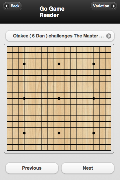
I used three different browsers to make the screen captures. They range from an ancient iPod Touch all the way up to the latest desktop version of Safari on OS X. It's interesting what a good job jQuery does across this big range of devices.
The Prototype
The jQuery Mobile site provides some boilerplate for a single web page with multiple virtual pages. They identify each screen using the HTML5 'data-' attribute. So for every screen I just need to create a div and set the 'data-role' attribute to 'page'.
The First ( Branches ) Selection Page
The first virtual page I create is the selection tab page. The code for it looks like this:
<!-- Start of first selection page (branches) -->
<div data-role="page" id="selectTabs">

 <div data-role="header">
  <h1>Game Types</h1>
 </div><!-- /header -->

 <div data-role="content">
  <ul data-role="listview" data-theme="g">
   <li><a href="#selectGames">Beginner ( 30 - 15 kyu )</a></li>
   <li><a href="#selectGames">Intermediate ( 15 - 1 kyu )</a></li>
   <li><a href="#selectGames">Expert ( 1 - 9 dan )</a></li>
   <li><a href="#selectGames">High Handicap</a></li>
  </ul>
 </div><!-- /content -->

 <div data-role="footer">
  <h4>Page Footer</h4>
 </div><!-- /footer -->
</div><!-- /page -->
One cool thing here is that the selection list is created with just an <ul> unordered list with its data-role set to 'listview'. Also, note the href is set to '#selectGames' to link to the second virtual page where users select the game they want to view.
The page comes out looking like this (on an iPod Touch):
The Second ( Leaf ) Selection Page
The next page for this prototype is the list page where users select the game they want to follow:
<!-- Start of second selection page (leaves) -->
<div data-role="page" id="selectGames">

 <div data-role="header">
  <h1>Games</h1>
 </div><!-- /header -->

 <div data-role="content">
  <ul data-role="listview" data-theme="g">
   <li><a href="#main">Fred (29k) vs Wilma (15k)</a></li>
   <li><a href="#main">Fred (29k) vs Barney (15k)</a></li>
   <li><a href="#main">Fred (29k) vs Pebbles (15k)</a></li>
   <li><a href="#main">Fred (29k) vs Bam Bam (15k)</a></li>
  </ul>
 </div><!-- /content -->

 <div data-role="footer">

 </div><!-- /footer -->
</div><!-- /page -->
Note the id of this virtual page is "selectGames" which is where the #selectGames href from the previous screen is pointing to. For the prototype testing I have put some fake games for the user to select. Whatever they select will take them back to the main page.
This looks like this (on a Color Nook tablet):
The Main Page
The main screen is slightly more complicated:
<!-- Start of the main page -->
<div data-role="page" id="main">
<div data-role="header" class="ui-grid-b">
<div class="ui-block-a">
<a href="#" data-icon="arrow-l" class="ui-btn-left ui-btn ui-btn-icon-left ui-btn-corner-all ui-shadow ui-btn-up-a" data-theme="a">
<span class="ui-btn-inner ui-btn-corner-all" aria-hidden="true">
<span class="ui-btn-text">Back</span>
<span class="ui-icon ui-icon-arrow-l ui-icon-shadow"></span>
</span>
</a>
</div>
<div class="ui-block-b"><h3>Go Game Reader</h3></div>
<div class="ui-block-c">
<a href="#" data-icon="arrow-r" class="ui-btn-right ui-btn ui-btn-icon-right ui-btn-corner-all ui-shadow ui-btn-up-a" data-theme="a">
<span class="ui-btn-inner ui-btn-corner-all" aria-hidden="true">
<span class="ui-btn-text">Variation</span>
<span class="ui-icon ui-icon-arrow-r ui-icon-shadow"></span>
</span>
</a>
</div>
</div><!-- /header -->
<a href="#selectTabs" data-icon="arrow-r" class="ui-btn-right ui-btn ui-btn-icon-right ui-btn-corner-all ui-shadow ui-btn-up-a" data-theme="c">
<span class="ui-btn-inner ui-btn-corner-all" aria-hidden="true">
<span class="ui-btn-text">Otakee ( 6 Dan ) challenges The Master ( 9 Dan )</span>
<span class="ui-icon ui-icon-arrow-r ui-icon-shadow"></span>
</span>
</a>
<div data-role="content">
<canvas width="400" height="400" id="goBoard">
<p>This example requires a browser that supports the
<a href="http://www.w3.org/html/wg/html5/">HTML5</a>
<canvas> feature.</p>
</canvas>
<div class="ui-grid-a">
<div class="ui-block-a"><button onClick="">Previous</button></div>
<div class="ui-block-b"><button onClick="drawNextMove()">Next</button></div>
</div><!-- /grid-a -->
</div><!-- /content -->
<div data-role="footer">
</div><!-- /footer -->
</div><!-- /page -->
Notice the first part of the page description has three areas for the Back button, title and Variation button. The class name of "ui-grid-b" on the header div is used to specify a container with three sections. The contents of each grid cell are in ui-block-a, ui-block-b and ui-block-c.
The next section is the game selection button. It's basically just a link button to the first selection page.
Underneath this is the canvas where the board is drawn.
And the final important part of the UI are the Next and Previous buttons. These are in a container with the class="ui-grid-a"tag. This divides the container into two columns.
And then there's the footer again, which we aren't doing anything with yet.
All together it looks like (on the desktop version of Safari):
I used three different browsers to make the screen captures. They range from an ancient iPod Touch all the way up to the latest desktop version of Safari on OS X. It's interesting what a good job jQuery does across this big range of devices.


