Showing posts with label jquery_mobile. Show all posts

Saturday, January 21, 2012

Step 5 - The New and Improved Board Object!

The first step in implementing the UML diagram is to create the board object.

The main changes I made to the board-drawing code were:
  1. Encapsulating the code inside a JavaScript object
  2. Removing the code for drawing the wood grain on the canvas
  3. Modifying the code so it would support multiple screen widths
The first step was pretty easy. Just like the game object, all it took was to define the object and then instantiate it in the code. In the constructor, I pass in the padding (in pixels) around the board, the width (in pixels) of the board, and the number of lines. Although currently it only supports 19 x 19 line boards.

The constructor looks like this:

// the code that draws the board encapsulated as an object
function Board( padding, width, lines )
{
	this.padding = padding; // padding around the board
	this.width = width;	// width of the actual playing area
	this.lines = lines;	// number of lines on the board 
	this.lineSpacing = (this.width)/(this.lines -1 ); // the spacing between the lines
	this.starPoints = [";S[dd]",";S[jd]",";S[pd]",";S[dj]",";S[jj]",";S[pj]",";S[dp]",";S[jp]",";S[pp]"]; //star points for a 19 x 19 board in SGF format

with the rest of the object being the methods drawBoardLines( ), sgfToXy( ), and drawPiece( ). The sgfToXy( ) and drawPiece( ) are going to disappear when I define the Stone object. Right now it's not 100% matching the UML diagram, but we're getting there :-)

Initially, when I created the board object, the callback wasn't working to start drawing the board lines. Since I'm just learning JavaScript I figured it had something to do with the way I was defining it as this.drawBoardLines( ). I planned to change the design so the board and stones were on separate canvases on top of the board image. Since the callback wasn't working, I thought it would be better to invest my time learning how to layer canvas elements than getting the callback working.

Since the canvas is transparent, this part just required some simple jQuery and CSS to position the canvas on top of an image of the board. It just took some googling and experimentation to figure it out. In go.js the new code looks like this:

// wait until the page is loaded to size and draw the board
$(document).ready(function()
{
	var thePadding = 10;
	var theLines = 19;
	
	// calculate the size of the board
	var boardWidth = Math.round($('#gameSelectBtn').width());
				  
	// after we know the width of the board we can instantiate a board object
	theBoard = new Board(thePadding, boardWidth, theLines);
	
	// next we set the image and board lines to the same value
	$('#goBoardImage').width(boardWidth +    (thePadding * 2));
	$('#goBoardImage').height(boardWidth +   (thePadding * 2));

	// NOTE: need to set width and height with .attr because $('#goBoard').width() will stretch the image and not 
	// change the actual size of the canvas
	$('#goBoard').attr("width", boardWidth + (thePadding * 2));    
	$('#goBoard').attr("height", boardWidth+ (thePadding * 2));
				  
	// thank you stackoverflow.com for the code to position the canvas over the top of the image of the board !!
	// http://stackoverflow.com/questions/683339/how-do-i-find-the-absolute-position-of-an-element-using-jquery
	var position = $('#goBoardImage').offset();
	$('#goBoard').css(position);
				  
    // finally, draw out the lines on the board
	theBoard.drawBoardLines();
});

Lines 33 and 34 position the canvas over the image. And Lines 22-29 resize the board after the page has loaded. One interesting thing is that if you use the .width() and .height() jQuery functions it will stretch the canvas instead of resizing it. So if the canvas originally started out as 100 x 100 pixels and you set the width x height to 400 x 400, you would still have a 100 x 100 canvas, but it would be displayed four times the original size!

The last step was to remove all of the hard-coded values in the original board code. Hard-coding values is a really bad practice, obviously. However, I like to code by making lots of small, fast refactorings, instead of a lengthy, massive push to get it all working perfectly right away.

All of the hardcoded values can be calculated from the three parameters initially passed in. The slightly tricky part was dynamically resizing the board based on the initial screen width. Eventually the board will be a property of the Player object. For now I created a global variable to hold the board object, but I couldn't instantiate it until after the page was loaded because I needed to know the page width. So I created the variable theBoard and assigned it 'null'.  Then later I assigned the instantiated board object, once I knew the page width:

var theBoard = null; // need this as a global variable but can't instantiate until after the page is loaded
...
// after we know the width of the board we can instantiate a board object
theBoard = new Board(thePadding, boardWidth, theLines);

The final change was a small improvement in the routine drawing the star points. The routine I had would work for a 19 x 19 board. If the board size changed in the future, the number and position of the star points would change. Since I had to re-write this method anyway to get rid of the hard-coded variables, I figured I could leverage the sgfToXy( ) method and use that to draw the star points.

In the future this will make it easy to add a multi-dimensional array indexed by the number of board lines which provides the appropriate star point pattern. So a 19 line board would be 'this.starPoints[19][ ]' and a 9 line board would be an array like 'this.starPoints[9][ ]'.


Thursday, January 5, 2012

Step 3 - Prototype testing with jQuery Mobile

I thought I would create a prototype to usability test the design. I'll use jQuery mobile since it's such a fantastic UI framework! You just need to know some basic HTML to make a mockup pretty quickly.

Some of the things I love about jQuery Mobile are:
  • It can load everything as a single page. The app screens are represented by divs in the HTML which makes them "virtual pages". So instead of loading lots of tiny little pages, jQuery mobile can load one big page and shuffle around the divs when users change screens (which reduces response times considerably).
  • It is über-cross-browser -- all the pain and agony in making a mobile app work across multiple browsers is baked into the jQuery Mobile goodness. How do they do it? I have no idea. ( I also don't know how my Subaru's fuel injection system works, but as long as it keeps working I'm happy :-)
  • It is very simple. Creating a prototype is just as easy as marking up some template html they provide. 
If this was a more complicated design, I might start out with paper-and-pencil prototypes. However, since this is just three screens I'll try it with a jQuery Mobile prototype first and see how that goes.

The Prototype

The jQuery Mobile site provides some boilerplate for a single web page with multiple virtual pages.  They identify each screen using the HTML5 'data-' attribute. So for every screen I just need to create a div and set the 'data-role' attribute to 'page'.

The First ( Branches ) Selection Page

The first virtual page I create is the selection tab page. The code for it looks like this:

<!-- Start of first selection page (branches) -->
<div data-role="page" id="selectTabs">

 <div data-role="header">
  <h1>Game Types</h1>
 </div><!-- /header -->

 <div data-role="content"> 
  <ul data-role="listview" data-theme="g">
   <li><a href="#selectGames">Beginner ( 30 - 15 kyu )</a></li>
   <li><a href="#selectGames">Intermediate ( 15 - 1 kyu )</a></li>
   <li><a href="#selectGames">Expert ( 1 - 9 dan )</a></li>
   <li><a href="#selectGames">High Handicap</a></li>
  </ul> 
 </div><!-- /content -->

 <div data-role="footer">
  <h4>Page Footer</h4>
 </div><!-- /footer -->
</div><!-- /page -->

One cool thing here is that the selection list is created with just an <ul> unordered list with its data-role set to 'listview'. Also, note the href is set to '#selectGames' to link to the second virtual page where users select the game they want to view.

The page comes out looking like this (on an iPod Touch):


The Second ( Leaf ) Selection Page

The next page for this prototype is the list page where users select the game they want to follow:

<!-- Start of second selection page (leaves) -->
<div data-role="page" id="selectGames">

 <div data-role="header">
  <h1>Games</h1>
 </div><!-- /header -->

 <div data-role="content"> 
  <ul data-role="listview" data-theme="g">
   <li><a href="#main">Fred (29k) vs Wilma (15k)</a></li>
   <li><a href="#main">Fred (29k) vs Barney (15k)</a></li>
   <li><a href="#main">Fred (29k) vs Pebbles (15k)</a></li>
   <li><a href="#main">Fred (29k) vs Bam Bam (15k)</a></li>
  </ul> 
 </div><!-- /content -->

 <div data-role="footer">
  
 </div><!-- /footer -->
</div><!-- /page -->

Note the id of this virtual page is "selectGames" which is where the #selectGames href from the previous screen is pointing to. For the prototype testing I have put some fake games for the user to select. Whatever they select will take them back to the main page.

This looks like this (on a Color Nook tablet):


The Main Page

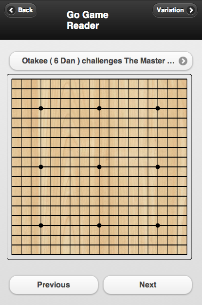
The main screen is slightly more complicated:

<!-- Start of the main page -->
<div data-role="page" id="main">

 <div data-role="header" class="ui-grid-b">
  <div class="ui-block-a">
   <a href="#" data-icon="arrow-l" class="ui-btn-left ui-btn ui-btn-icon-left ui-btn-corner-all ui-shadow ui-btn-up-a" data-theme="a">
    <span class="ui-btn-inner ui-btn-corner-all" aria-hidden="true">
     <span class="ui-btn-text">Back</span>
     <span class="ui-icon ui-icon-arrow-l ui-icon-shadow"></span>
    </span>
   </a>
  </div>
  <div class="ui-block-b"><h3>Go Game Reader</h3></div>
  
  <div class="ui-block-c">
   <a href="#" data-icon="arrow-r" class="ui-btn-right ui-btn ui-btn-icon-right ui-btn-corner-all ui-shadow ui-btn-up-a" data-theme="a">
    <span class="ui-btn-inner ui-btn-corner-all" aria-hidden="true">
     <span class="ui-btn-text">Variation</span>
     <span class="ui-icon ui-icon-arrow-r ui-icon-shadow"></span>
    </span>
   </a>
  </div>
 </div><!-- /header -->

 <a href="#selectTabs" data-icon="arrow-r" class="ui-btn-right ui-btn ui-btn-icon-right ui-btn-corner-all ui-shadow ui-btn-up-a" data-theme="c">
  <span class="ui-btn-inner ui-btn-corner-all" aria-hidden="true">
   <span class="ui-btn-text">Otakee ( 6 Dan ) challenges The Master ( 9 Dan )</span>
   <span class="ui-icon ui-icon-arrow-r ui-icon-shadow"></span>
  </span>
 </a>

 <div data-role="content"> 
  <canvas width="400" height="400" id="goBoard">
   <p>This example requires a browser that supports the
   <a href="http://www.w3.org/html/wg/html5/">HTML5</a> 
    &lt;canvas&gt; feature.</p>
  </canvas>
  
 <div class="ui-grid-a">
  <div class="ui-block-a"><button onClick="">Previous</button></div>
  <div class="ui-block-b"><button onClick="drawNextMove()">Next</button></div>
 </div><!-- /grid-a --> 
  
 </div><!-- /content -->

 <div data-role="footer">
 
 </div><!-- /footer -->
</div><!-- /page -->

Notice the first part of the page description has three areas for the Back button, title and Variation button. The class name of  "ui-grid-b" on the header div is used to specify a container with three sections. The contents of each grid cell are in ui-block-a, ui-block-b and ui-block-c.

The next section is the game selection button. It's basically just a link button to the first selection page.

Underneath this is the canvas where the board is drawn.

And the final important part of the UI are the Next and Previous buttons. These are in a container with the class="ui-grid-a"tag. This divides the container into two columns.

And then there's the footer again, which we aren't doing anything with yet.

All together it looks like (on the desktop version of Safari):


I used three different browsers to make the screen captures. They range from an ancient iPod Touch all the way up to the latest desktop version of Safari on OS X. It's interesting what a good job jQuery does across this big range of devices.