Showing posts with label design. Show all posts

Sunday, September 22, 2013

My Micro Green Roof - Planning

Last winter a huge wind storm, with gusts of up to 75 mph, passed through my town knocking down trees and power lines. I remember hearing the wind howl and watching the hanging lights inside gently swinging back and forth. One casualty was my garden shed's roof, which lost a few rows of shingles. By July I still hadn't repaired it, but was reluctantly preparing to buy some asphalt shingles from Home Depot and repair it.

Before buying the supplies, though, I spotted a book called Small Green Roofs. The authors' premise is that while big green roofs for houses or offices are expensive and complicated, any idiot with a hammer can build a small green roof. "Hey, I'm an idiot with a hammer," I thought to myself, so I kept reading. Although, the book wasn't a step by step manual, it still had all the information I needed. I guess the field is too new and once they can write step by step instructions, it won't be as interesting.  So I decided as long as I needed to fix my roof, I would try to make the project interesting.

Two initial concerns were with the wind and the fire protection of a green roof. As I mentioned above, the Caribou Valley in Nederland gets some strong winds. And unfortunately, wildfires are a yearly danger here, too.  I was pleasantly surprised to learn a green roof can be more resistant to wind than a shingled roof because the roots can grow it into one big mat that can't be lifted by the wind. Also, since a green roof tends to be mainly rocks, dirt and succulent plants, one source said the fire risk is equivalent to a tile roof.

Project Planning
My first step was to assess the shed's roof and do some background research for my area. I drew out the following map of the roof :


Next I calculated the maximum load for the roof. The authors say "You can have fun with all of the other elements of a green roof, but you must make sure the roof does not collapse." I calculated out about 107 sq feet of area for my shed. Next, using the handy load chart in Small Green Roofs I realized that if I put up five inches of rock and top soil on the roof, I could have a maximum load of around 4500 lbs ( ~2000 kg ) when it got wet!

So I started checking out my shed to see if it could handle the weight. Once again I was pleasantly surprised. The guy we bought the house from had built a solid shed. The rafters were spaced one foot apart. The walls were solid wood made of stacked two by fours.

Still, I talked to my Dad who knows a lot about carpentry, and he suggested I reinforce the main beam going across and some of the rafters. He suggested getting a long 2 x 4 and using liquid nails to glue it to the current beam, then attach them together with screws.

Local Research
The authors of the book are located in England, but I'm in Colorado. Our climate is semi-arid, alpine with 17 inches of precipitation per year, while they receive about 33 inches. So I searched on local green roofs and found some excellent resources:
I thought my local weather wouldn't allow me to have a green roof, but I was surprised how flexible they can be. Even though my climate is totally different from the UK, it still can support a green roof. In fact the typical green-roof plants are selected because they can grow in harsh conditions in rocky, nutrient-poor soils. Many of the plants that fit the bill are alpine plants and sedums. To be honest, reading through a list of appropriate plants for a green roof is like reading through a catalog of the plants growing in my yard! ( More on this in a later post ).

The Carpentry
There really isn't a lot to say about this. For the box to contain the garden I just decided on some 1 x 6's of weather-proof wood. I attached these to the roof with angle brackets. I also decided to follow my Dad's advice and bought enough 2 x 4's to reinforce the rafters and main supporting beam. Altogether, the lumber and hardware ended up costing me just under $50.

The Design of the Waterproof Layers
One goal on this project was to complete it without breaking the bank. Even a small roof like this could have cost $1000 or more. I was shooting for something in the $300 range. This was still a lot more that the $50 or so asphalt tiles would have cost me at Home Depot, but hopefully the final result is nicer :-)

So for the waterproof layer I decided on an inexpensive pond liner from Amazon.com. Checking amazon.com now, I see they have a 10' x 13' pond liner for just $60. Unfortunately for me the square footage was good, but the dimensions wouldn't work for me. So I ended up buying some pond liner tape for $20 so I could cut apart the pond liner and tape it together to the size I needed.

The Design of the Soil
My initial plan was to take a few wheelbarrows full of dirt and rocks and dump them on top of my shed. But after my initial calculations, I realized soil and gravel might be enough to collapse even my bomb-shelter quality roof when it got wet. So I looked around at the different alternatives and decided to stick with a standard for green roofs -- lightweight expanded shale. It's a lightweight rock made by heating shale to high temperatures. It's also pretty cheap. I could have gotten it in bulk from a local manufacturer for only about $50 / ton. Unfortunately hiring a construction truck to get it to my place would have cost me way more than the cost of the shale :-(

I also looked into zeolite which has a lot of great advantages for a green roof, but since I didn't own a truck and the guy I was talking to had it marked up to around $400/ton, I ruled that out as well.

So I paid a guy with a pickup truck to go to a building supply center in Longmont and pick up the ton and a half I needed. I decided on a mixture of 70% shale with 15% compost and 15% peat moss, ( according to the information I'd found from the sources listed above ). The cost of the shale and transport ended up being $200.

Plants
I thought this would the easiest part of the roof design process. I went to my local nursery and told them I was looking for recommendations for green roof plants. The response was along the lines of "Oh cool -- I have no idea what to recommend." They thought the green roof was a great idea, but apparently they didn't get a lot of business from green roofs and had no idea what to recommend. They suggested I visit the Denver Botanic Garden's green roof, which was a great recommendation because I could see the plants and create a list there and then go back and buy them. Ultimately I spent about $90 on plants for the roof.

Conclusion
Overall, I've been pretty happy with the design of the shed roof, although if I could go back there are some things that I'd like to change:
  • Use natural substances - I used pressure-treated lumber and a PVC-based liner for the roof. Ideally I'd have liked something that could be recycled. When the shed is at the end of its useful life, both the lumber and the liner will have to be thrown away. All of the hardware can be 100% recycled or re-used. And the shale can be mixed into the yard soil to improve the drainage. It's just the liner and the boards that ultimately don't have anywhere to go.
  • Use local plants - Since I live at around 8,500 feet a lot of the alpine plants that do well on a green roof also grow in my yard. In retrospect I should have saved myself $90 and just selected wildflowers and ground cover from my yard rather than buying plants at the nursery. One of the methods they mention in the book for populating the roof with plants is just to let natural plants take over. In retrospect I probably would have been better off doing this.


Sunday, January 29, 2012

Step 6 - The Stone Image

A Better-Looking Stone

There are a lot of enjoyable experiences in playing Go on a real board. There is the polished, wooden pine board.  There's the feel of the stones and the small 'click' they make as they are played. The stones drawn in the previous posts were just flat disks that didn't recreate the image of a real go board. In order to make the stones a bit more evocative of a real Go board, let's add a highlight and shadowing to make them more three-dimensional.

One of the great things about the HTML5 Canvas element is its flexibility. If you can imagine an image, there must be a way to draw it. One perfect effect for creating a 3-D stone is the radial gradient effect that can create a realistic highlight for the stone.

To use a radial gradient with jCanvas you just create a gradient color and draw objects with it. It's kind of like creating a gradient color and adding it to your palette. So instead of drawing a stone with black or white, you draw it with your custom-made radial gradient color.

The radial gradient is built by assuming there are two circles of different colors and the gradient flows between them. The x1,y1 and x2,y2 are the center points of the two circles. The r1 and r2 values are the radii of the circles. C1 is the color of the first circle and c2 is the color that it gradually flows into.

After playing with the values for awhile, I placed the center points of the circles to the upper-left of the center point of the main circle. I started with a small radius of 2 for the smaller circle and made the second circle match the full radius.
// set the begin and end colors for black
var beginColor = "#4C4646";
var endColor = "#000000";

// figure out the color of the piece
if(theMove.charAt(1)== "W")
{
 // begin and end colors for white
 var beginColor = "#ffffff";
 var endColor = "#DDDDDD";

}

// calculate the radius so it is half of the line spacing minus one pixel so stones aren't on top of each other
var theRadius = (this.lineSpacing / 2) - 1;

var radial = $("canvas").gradient({
          x1: theConvertedValue.x-(theRadius/2), y1: theConvertedValue.y-(theRadius/2),
          x2: theConvertedValue.x-(theRadius/2), y2: theConvertedValue.y-(theRadius/2),
          r1: 2, r2: theRadius,
          c1: beginColor,
          c2: endColor
          });


After looking at the white piece, it looked really plastic-like. So to change this, I added a shadow blur around the edge of the piece. This was accomplished by adding the following attributes when the stone was drawn:
   shadowColor: "#000",
   shadowBlur: 2,


It looked better, but still not quite realistic. So finally I added just a subtle drop shadow on the lower-right side:
shadowX: 1, shadowY: 1,


So the final drawing routine was just:
// use jCanvas to draw the piece
$("canvas").drawArc({
   fillStyle: radial,
   shadowColor: "#000",
   shadowBlur: 2,
   shadowX: 1, shadowY: 1,
   strokeWidth: 1,
   x: theConvertedValue.x, y: theConvertedValue.y,
   radius: theRadius
 });
}


And so now the new stones look like this!:


Thursday, January 12, 2012

Step 4 - The UML Code Design

Before going any further, I thought I'd perform a simple object analysis to discover the objects, methods and properties in the application.

A Quick & Dirty Object Analysis

I forget where I learned this, but this object decomposition technique has been a really helpful. First, I write a paragraph that describes what happens in the application in just plain English. Next I read over the paragraph and bold the nouns and underline the verbs. The nouns become the classes and the verbs are the methods (and a lot of adjectives in the paragraph will end up as properties).

So, for this application, the description would be pretty straight-forward:
The player selects a game from one of several categories. The board is displayed with a Next and Previous button underneath it. The player clicks next and a stone is displayed on the board with a label (e.g. a number or shape) and may be highlighted. The player can click previous and the last stone will be removed from the board. After the stones are displayed the SGF game file will be interpreted. Comments are displayed if there are any in the SGF game file for that move. The player can either dismiss a comment or click Next to see the next comment.
So separating out the nouns (classes) and verbs (methods) this quick & dirty object analysis provides the following:

Nouns
player
game ( SGF game file )
category
stone
comment
board

Verbs
select {game}
draw {stone}
remove {stone}
select {stone}
interpret {comment}
display {comment}
dismiss {comment}
click_next {player? game? I'm not too sure right now what this should apply to...}
click_previous {player? game? I'm not too sure right now what this should apply to...}

UML Diagram
So taking these, it's easy to build a rough UML diagram:


Thursday, January 5, 2012

Step 3 - Prototype testing with jQuery Mobile

I thought I would create a prototype to usability test the design. I'll use jQuery mobile since it's such a fantastic UI framework! You just need to know some basic HTML to make a mockup pretty quickly.

Some of the things I love about jQuery Mobile are:
  • It can load everything as a single page. The app screens are represented by divs in the HTML which makes them "virtual pages". So instead of loading lots of tiny little pages, jQuery mobile can load one big page and shuffle around the divs when users change screens (which reduces response times considerably).
  • It is über-cross-browser -- all the pain and agony in making a mobile app work across multiple browsers is baked into the jQuery Mobile goodness. How do they do it? I have no idea. ( I also don't know how my Subaru's fuel injection system works, but as long as it keeps working I'm happy :-)
  • It is very simple. Creating a prototype is just as easy as marking up some template html they provide. 
If this was a more complicated design, I might start out with paper-and-pencil prototypes. However, since this is just three screens I'll try it with a jQuery Mobile prototype first and see how that goes.

The Prototype

The jQuery Mobile site provides some boilerplate for a single web page with multiple virtual pages.  They identify each screen using the HTML5 'data-' attribute. So for every screen I just need to create a div and set the 'data-role' attribute to 'page'.

The First ( Branches ) Selection Page

The first virtual page I create is the selection tab page. The code for it looks like this:

<!-- Start of first selection page (branches) -->
<div data-role="page" id="selectTabs">

 <div data-role="header">
  <h1>Game Types</h1>
 </div><!-- /header -->

 <div data-role="content"> 
  <ul data-role="listview" data-theme="g">
   <li><a href="#selectGames">Beginner ( 30 - 15 kyu )</a></li>
   <li><a href="#selectGames">Intermediate ( 15 - 1 kyu )</a></li>
   <li><a href="#selectGames">Expert ( 1 - 9 dan )</a></li>
   <li><a href="#selectGames">High Handicap</a></li>
  </ul> 
 </div><!-- /content -->

 <div data-role="footer">
  <h4>Page Footer</h4>
 </div><!-- /footer -->
</div><!-- /page -->

One cool thing here is that the selection list is created with just an <ul> unordered list with its data-role set to 'listview'. Also, note the href is set to '#selectGames' to link to the second virtual page where users select the game they want to view.

The page comes out looking like this (on an iPod Touch):


The Second ( Leaf ) Selection Page

The next page for this prototype is the list page where users select the game they want to follow:

<!-- Start of second selection page (leaves) -->
<div data-role="page" id="selectGames">

 <div data-role="header">
  <h1>Games</h1>
 </div><!-- /header -->

 <div data-role="content"> 
  <ul data-role="listview" data-theme="g">
   <li><a href="#main">Fred (29k) vs Wilma (15k)</a></li>
   <li><a href="#main">Fred (29k) vs Barney (15k)</a></li>
   <li><a href="#main">Fred (29k) vs Pebbles (15k)</a></li>
   <li><a href="#main">Fred (29k) vs Bam Bam (15k)</a></li>
  </ul> 
 </div><!-- /content -->

 <div data-role="footer">
  
 </div><!-- /footer -->
</div><!-- /page -->

Note the id of this virtual page is "selectGames" which is where the #selectGames href from the previous screen is pointing to. For the prototype testing I have put some fake games for the user to select. Whatever they select will take them back to the main page.

This looks like this (on a Color Nook tablet):


The Main Page

The main screen is slightly more complicated:

<!-- Start of the main page -->
<div data-role="page" id="main">

 <div data-role="header" class="ui-grid-b">
  <div class="ui-block-a">
   <a href="#" data-icon="arrow-l" class="ui-btn-left ui-btn ui-btn-icon-left ui-btn-corner-all ui-shadow ui-btn-up-a" data-theme="a">
    <span class="ui-btn-inner ui-btn-corner-all" aria-hidden="true">
     <span class="ui-btn-text">Back</span>
     <span class="ui-icon ui-icon-arrow-l ui-icon-shadow"></span>
    </span>
   </a>
  </div>
  <div class="ui-block-b"><h3>Go Game Reader</h3></div>
  
  <div class="ui-block-c">
   <a href="#" data-icon="arrow-r" class="ui-btn-right ui-btn ui-btn-icon-right ui-btn-corner-all ui-shadow ui-btn-up-a" data-theme="a">
    <span class="ui-btn-inner ui-btn-corner-all" aria-hidden="true">
     <span class="ui-btn-text">Variation</span>
     <span class="ui-icon ui-icon-arrow-r ui-icon-shadow"></span>
    </span>
   </a>
  </div>
 </div><!-- /header -->

 <a href="#selectTabs" data-icon="arrow-r" class="ui-btn-right ui-btn ui-btn-icon-right ui-btn-corner-all ui-shadow ui-btn-up-a" data-theme="c">
  <span class="ui-btn-inner ui-btn-corner-all" aria-hidden="true">
   <span class="ui-btn-text">Otakee ( 6 Dan ) challenges The Master ( 9 Dan )</span>
   <span class="ui-icon ui-icon-arrow-r ui-icon-shadow"></span>
  </span>
 </a>

 <div data-role="content"> 
  <canvas width="400" height="400" id="goBoard">
   <p>This example requires a browser that supports the
   <a href="http://www.w3.org/html/wg/html5/">HTML5</a> 
    &lt;canvas&gt; feature.</p>
  </canvas>
  
 <div class="ui-grid-a">
  <div class="ui-block-a"><button onClick="">Previous</button></div>
  <div class="ui-block-b"><button onClick="drawNextMove()">Next</button></div>
 </div><!-- /grid-a --> 
  
 </div><!-- /content -->

 <div data-role="footer">
 
 </div><!-- /footer -->
</div><!-- /page -->

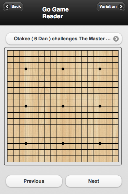
Notice the first part of the page description has three areas for the Back button, title and Variation button. The class name of  "ui-grid-b" on the header div is used to specify a container with three sections. The contents of each grid cell are in ui-block-a, ui-block-b and ui-block-c.

The next section is the game selection button. It's basically just a link button to the first selection page.

Underneath this is the canvas where the board is drawn.

And the final important part of the UI are the Next and Previous buttons. These are in a container with the class="ui-grid-a"tag. This divides the container into two columns.

And then there's the footer again, which we aren't doing anything with yet.

All together it looks like (on the desktop version of Safari):


I used three different browsers to make the screen captures. They range from an ancient iPod Touch all the way up to the latest desktop version of Safari on OS X. It's interesting what a good job jQuery does across this big range of devices.

Sunday, January 1, 2012

Step 2 - Something Closer to the Right Design

Yeah... I was right... The day after I drew out the wrong design I woke up and realized exactly how it was wrong :-(

Some of the problems obvious to me now are:
  1. The design is not suited to a typical smartphone screen. The board takes up most of the real-estate and either the controls or comments will be below the fold.
  2. Referencing the stones with numbers is not smart. The numbers should really only represent the number of the move. People have probably been documenting Go games in print for a hundred years or so. So why am I trying to re-invent that wheel?
  3. What was I thinking when I put in a select menu to pick a game :-(  Earlier I mentioned the offline storage could take hundreds of games! A select menu is definitely the wrong design pattern to use... A better pattern would be something like the one Apple uses for selecting a photo or downloading a podcast.
  4. The design would look odd on an iPad or other tablet... Also there's the portrait / landscape orientations to consider...
So here is take 2:

To address the first two problems, a redesign of the main screen:

The main features here are:
  • Overlaying the comments on the Go board itself to save screen real-estate
  • The only numbers displayed on the stones will be black and white's last plays
  • If a stone needs to be referenced, but it doesn't have a number already, a triangle will be displayed
  • Having a separate button to see a game variation instead of scrolling down to see it
  • Changing the drop down to a set of selection screens instead
Speaking of the selections screens... here's what I was thinking of:

The selection screens would use a similar design pattern to Apple's iPod Touch / iPhone for gathering photos in separate folders/tabs:


And once the user clicks on a folder/tab they would see individual games to select:


As far as problem 4... that's a tough one... Something like this might be good:


In landscape mode, the board would be (nearly) as large as it possibly could be, and then in the free space to the right the controls, comments, and any variation would appear. If I moved the title and sub-title to the right, then that would maximize the board size to its limit.

I just started reading this really great book Head First Mobile Web and it's talking about Responsive Web Design. I think that will really help out with problem 4. So I guess for right now I'll just keep this idea in my head and I'll see how/if the responsive web design will help out later down the road...